

UX audit for an MLOps app’s function
THE THEORY OF PRODUCT DESIGN - APPLIED
Situation: the principal is company that has a product, a metadata store tailored for MLOps, offering robust experiment tracking and model registry capabilities. It serves as a centralized hub, providing ML teams with visibility and control over their models.
Task: one of the primary tasks the users undertake is comparing model training runs. Users often work with multiple versions of trained models and want to evaluate their performance based on key metrics like accuracy, precision, and recall. They seek insights into effective hyperparameters and differences in inputs and outputs across runs.
Action: I was tasked with auditing the “Compare model training runs” function within the application. My objective was to identify user experience challenges and friction points associated with this critical feature.
Result: I conducted a comprehensive evaluation, documenting theoretical considerations and practical observations. This approach yielded a well-rounded overview of the function's problems and provided insights on addressing these issues. As a result, I developed wireframes targeting immediate improvements to enhance user experience and functionality.
Preface
I compiled a comprehensive document detailing my findings. Out of respect for the team, who are actively addressing various issues, I will not disclose all my findings. Instead, this case study will provide a high-level overview, demonstrating my approach to conducting a UX audit.
My work is based on this public project (as of its state in April 2024). If you experience any differences compared to the screenshots, please acknowledge that perhaps they already changed a few things.
I share the Data Scientist persona in the Appendix (bottom of this page) that is used as a target audience for this task.
THEORY
1. Initiation
When I approach a new task - especially when I know nothing about the domain -, I start familiarizing myself by researching. Gathering and analyzing data, reading related research, checking competitors and playing around with the focus product are the first steps.
In detail, I go through the following steps:
Competitor analysis: does this feature exist in competitor products? If yes, how does it work, what kind of options do they offer? What is the user feedback on those?
User research: conduct interviews and surveys with Data Scientists to understand their workflow, pain points, and needs regarding model comparison.
Persona analysis: overview the provided persona(s) that helps me to gain insights into their goals, responsibilities, and success metrics.
Task analysis: break down the process of “Compare model training runs” into specific tasks that Data Scientists typically perform. Identify pain points, bottlenecks, and areas where the current workflow could be improved to better support their needs.
2. Evaluation
After having a good understanding of the application, the feature and the focus audience, I’m able to evaluate the feature itself.
2.1. User experience
First, I focus on the user experience - I want to answer the following questions:
Documentation and learning curve: do I need to read a ton of documentation, or is the platform easy to use? In short, how hard is it to learn? This question might be biased, because I’m not a member of the focus audience (I’m not a data scientist).
Navigation and information architecture: is the interface intuitive? Can users easily locate the feature? Is the organization of features and functions logical and clear? Is the information presented in a comprehensible manner?
Responsiveness: can it be used across multiple devices and operating systems?
Accessibility compliance: such as support for screen readers, keyboard navigation, and alternative text for images. Does the application meet relevant standards?
Error handling and communication with the users: is there available guidance for the users to solve the problems by themselves?
Performance and speed tests: is completing a task within the acceptable time frame? In other words: does the application perform the “Compare model training runs” feature tasks fast enough?
User feedback and support: does the application offer the opportunity to the users to give feedback? How does the application collect data for further analysis, so that it can be improved? Also, the responsiveness of the support channels can be tested.
User satisfaction and engagement: I’d assess the main metrics, such as net promoter score (NPS), customer satisfaction score (CSAT), task completion rate, time on task, session duration, feature adoption rate. There are, of course, other metrics that might help in evaluating this feature, however, at this point I think these are the most relevant ones.
2.2. User interface
Usability and accessibility: does it offer a dark mode? How is its appearance in terms of colours, fonts, and layout? Is the user interface accessible, including features like screen reader support, keyboard navigation, and color contrast? Verify if the screen reader functions correctly.
Flexible user interface: does it offer rearranging, customization? If yes, on what level? This should be measured against user feedback (e.g. if it’s really a pain point).
Navigation: this is somewhat related to the information architecture mentioned above, however, in this case, I’d check if the navigation labels and hierarchy are clear and intuitive, allowing users to easily find and access the feature.
Data visualization: are visualizations informative, easy to interpret, and do they support the analysis and comparison of different runs?
Interactivity and user controls: such as filters, sorting options, and drill-down capabilities. Do users have sufficient control over the data displayed and can they customize views to focus on relevant information?
Consistency and visual design: basically the evaluation of the availability and proper usage of the design system.
User feedback: conduct user testing sessions or gather feedback from Data Scientists to understand their experience with the UI. Incorporate their feedback to identify usability issues, pain points, and areas for improvement in the UI design.
2.3. Feature evaluation
Assess the existing features related to “Compare model training runs”, including visualization capabilities, metric tracking, hyperparameter analysis, and collaboration tools. It should be examined how well these features align with the goals and responsibilities of Data Scientists as outlined in the persona.
2.4. Usability testing
Conduct usability testing sessions with Data Scientists to observe how they interact with the “Compare model training runs” feature. Identify any usability issues, confusion, or inefficiencies in the current design and workflow. Gather qualitative feedback on the user experience and any specific pain points encountered during the testing sessions.
2.5. Feature gap analysis
Compare the existing features to the needs and goals outlined in the Data Scientist persona. Identify any gaps or missing functionality that would better support Data Scientists in their model comparison tasks.
2.6. Documentation
Once all the data is gathered following the evaluation steps mentioned earlier, I’ll create a comprehensive report detailing the findings. I will then distill this information into a concise presentation for the stakeholders. This presentation will encompass key conclusions drawn from the evaluation along with a range of suggestions for enhancements. By presenting this information effectively, stakeholders will be empowered to make informed decisions efficiently.
PRACTICE
1. Initiation
After creating my own account, I opened the test project. I had to learn more about the application, especially the “Compare model training runs” feature. I found a video and I read the related documentation.
2. Basic evaluation

2.1. Navigation and information architecture
2.1.1 Intuitiveness
Overall, the platform lacks clear descriptions or simple guidance for its features. While there are tooltips or brief information, they lack context. Initially, understanding the platform and its logic can be overwhelming, though this may vary for a Data Scientist who is familiar with what to look for.

Generic observations:
Click the “eye” icon to select models for comparison, although best practices show that checkboxes are usually used for this purpose in UI.
Clicking a checkbox activates a menu at the top. Because I initially clicked the checkbox lower on the left, I didn’t notice the menu that appeared above everything else at first, I expected something on the “middle”, somewhere near the selected items.
To compare, users should navigate to the "Compare runs" tab at the top center. However, after selecting models, it may not be clear that this is the next step.

Charts:
There’s no further information about the chart or its purpose.
Images:
No usage instructions provided: is it solely for manual comparison? Shouldn’t there be additional details about the images, like metadata? (A few data pieces appear if I hover the cursor over the name, but I can’t do anything with it.)
If it’s for manual comparison: shouldn’t there be a zoom & compare option for at least two images side by side?
Parallel coordinates:
This feature finally offers a detailed usage description, but clicking “Help” unexpectedly opens accordion-style content.
Step 4/4 of the “Help” suggests using right-click for options, but on Mac, I only see default browser options, not the expected in-built ones. I had to watch the video to understand that it works differently on Mac, and I assume the Help was written focusing on Win-users.
What does “Selected: x/x (x%)” on the top row signify? It took me a bit to understand that this has something to do with the selected items, after I selected a part of an axis.
Why does it only allow downloading in PNG format? Why not other formats, e.g. SVG?

Side-by-side:
I’d anticipate additional actions like exporting filtered data only, or saving the setup. Careful integration of AI could enhance users’ ability to draw conclusions from the dataset.
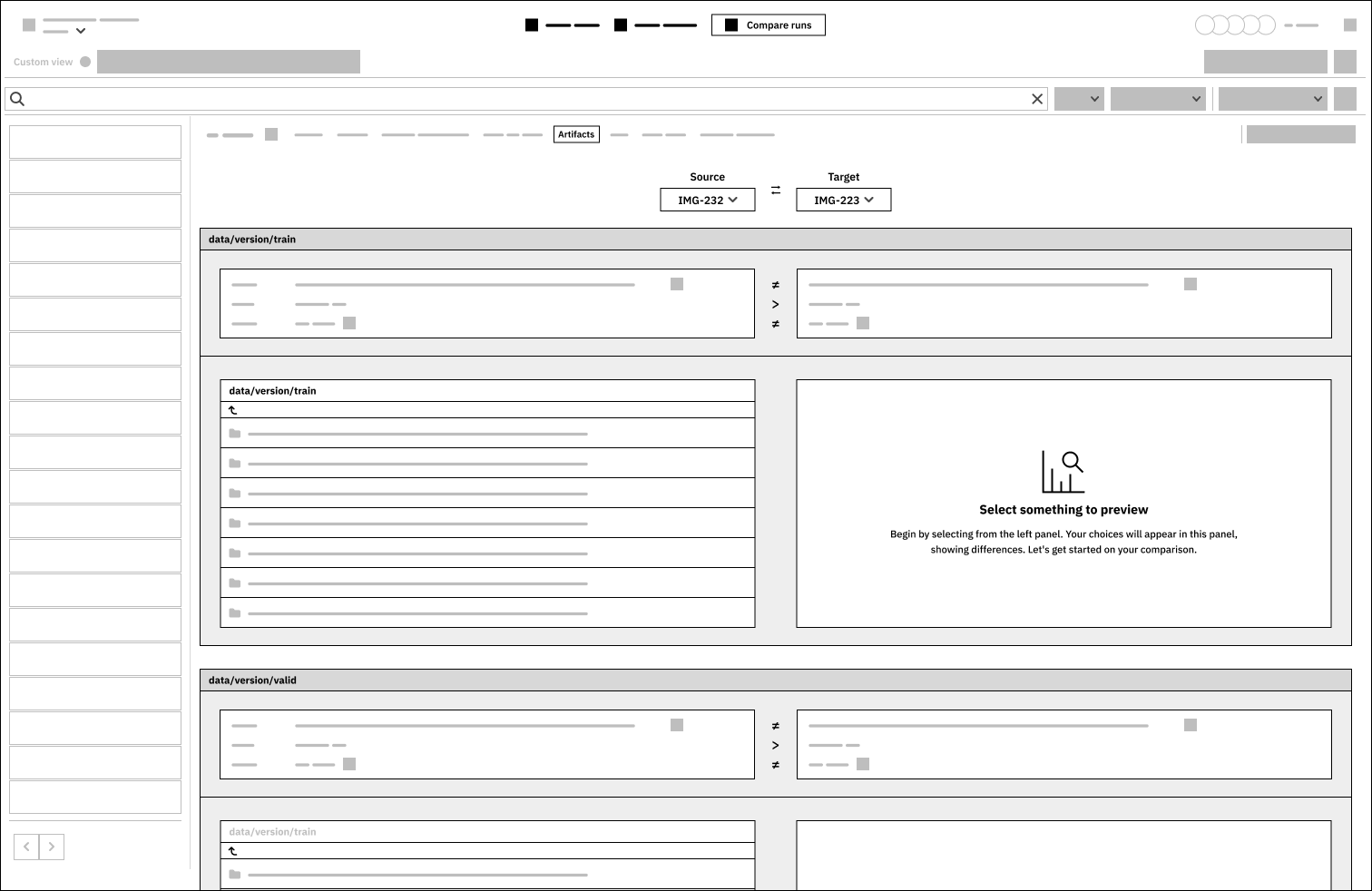
Artifacts:
The UI design for displaying information about different models is difficult to understand. It took me a while to realize that the large panel for “data/version/train” is logically connected, including a comparison panel, a file structure, and a display panel.
The source selection should visually connect with the data below, indicating that left-side information corresponds to left items and vice versa.

2.1.2. Content and tone of voice
There’s a lack of information, descriptions, or guidance. While tooltips are helpful, having explanations, use cases, suggested scenarios, or actionable guidance would be beneficial.
The use of capital letters is not consistent: for example, on the “Compare runs” tab, there is “Parallel coordinates” and “Training Overview”. I’m not sure if it’s by default, or the latter is a custom tab, but it would be nice to have consistency here.
Following standard tone-of-voice guidelines, CTAs should have straightforward labels that indicate clear actions. When no item is selected, a message prompts to compare data across runs with a CTA labeled “Select first 5 to compare” – but what does “first 5” refer to? (Yes, if a person reads it together with the title and the description, it makes sense.)
More precise wording and relating illustration should be used on blank pages.
Related content should be “grouped”, for example, by using different colors for the containers. This way the user can process that information, boxes, containers belong together, while others are slightly different.
There should not be abbreviations. In a complex, extensive platform like this, there should be clear, precise and human-readable labels and titles.
2.2. Data visualization
2.2.1. Interpretability
Users should be able to interpret and analyze performance metrics (e.g. accuracy, precision, recall) across different model training runs. This involves understanding how well each model performed and identifying trends or patterns in the data. Based on this, I believe that the product provides a wide range of opportunities and could be used well.
2.3. Consistency in design and layout
2.3.1. Visual clarity and hierarchy
Visual clarity means making sure text and graphics are easy to read with the right font sizes and contrast, establishing a clear hierarchy to prioritize important information (reducing cognitive load). Because users need to process a lot of visual information, it’s recommended to use the design system consistently throughout the entire application.
When it comes to hierarchy, it would be nice to have a clear understanding about the dependencies and the cross-references at first sight.
2.3.2. Interactivity and user controls
There’s no dark mode, at least I could not find it.
On the left panel, where the items are listed, there are two navigation buttons at the bottom, and it’s not clear where the content jumps when I click them.
In the Data Scientist persona, there are a few goals…
Two specific goals related to handling analysis results (“Be able to reproduce previous experiments”, and “Have an effective way of packaging ML models and passing them to production”), but it’s unclear how they can do this. While there’s a “Save as new” button next to Charts and Images, there’s no clear action indicating that the experiment setup can be saved and rerun.
There’s a goal “Enhance currently used tools, e.g., adding versioning to Jupyter notebooks”, and I’m wondering, where can users find any cross-reference or smooth way to link to Jupyter?
The “Help” option (on the Parallel coordinates) stands out with its use of different components, colors, and fonts compared to what I’m accustomed to. Is this an embedded 3rd party sub-feature?
2.4. Responsiveness
For the sake of this recruitment task, I did not run a comprehensive test, but the overall impression is that this is on a satisfying level.
2.5. Accessibility
For the sake of this recruitment task, I did not run a comprehensive test, but I ran a quick assessment using a browser extension, and it listed a few things: colour contrast, discernible names for CTAs and links, accessible names for input fields, lang attribute for the HTML document.

2.6. Error handling and feedback
I did not encounter any phenomenon requiring error handling, I have no opinion on this matter at this point.
2.7. User flow and task completion
I can’t determine the speed at which a Data Scientist could complete tasks, but I quickly grasped the connections in the comparisons, which were understandable even to someone without specialized knowledge. I didn’t measure the time it took.
3. Recommendations
3.1. Impactful issues
I believe the low hanging fruits are those items that come with the smallest changes and the most spectacular results. Based on the initial, basic audit, I think these are the following:
The Side-by-side tab could offer sub-features to help users gather more relevant data, summarize results, and draw conclusions. Implementing AI might speed up these actions.
The Artifacts tab could organize data and its sources in a clearer manner.
When the Test tab is blank, the description could provide additional guidance and information. This could include listing knowledge-sharing articles, linking related videos, or using simple animations to indicate where to find additional fields for comparison.
3.2. Wireframes
From the above three, I selected the Artifacts tab, below you can find the low-fidelity wireframes.

Appendix
The Data Scientist persona
Alternative job titles: ML Researcher, AI Researcher, Research Scientist, Deep Learning Researcher,
Company role:
The scientist of the ML team.
Explores and researches ways to apply and improve ML models to business problems. The models they develop are usually not yet ready for production, they pass them manually or automatically to the ML engineers.
They create proof of concepts (POC) in Jupyter notebooks or Streamlit apps, do a presentation of data insights (Slides) to other stakeholders, and sometimes publish papers or blogs about the work they are doing.
Job responsibilities
Translating business needs to ML use cases and building models to solve these business problems
Compiling and preprocessing data (this may be a separate role in mature orgs)
Training and fine-tuning models
Evaluating model performance, comparing models, and choosing the best-performing ones
Passing all the information about the deployment-ready models to ML Engineers
Evaluating novel algorithms and approaches
Goals
Be able to visualize, analyze and compare model-building metadata
Collaborate on experiment results with other team members
Be able to reproduce previous experiments
Have an effective way of packaging ML models and passing them to production
Be able to present the results of their work to the business
Work more efficiently:
Spend less time on mundane tasks like HPO, data storage, and access, moving models to MLEs
Spend less or no time on environment setup
Enhance currently used tools, e.g., adding versioning to Jupyter notebooks
How do they measure success?
Success for the person:
Product-related KPIs (e.g., increase the Revenue per User in the first 7 days)
Successful use of your tool:
All model development metadata is documented in one place and accessible for everyone and from everywhere
At any time, they can find information about how the model was built and what data was used
All metadata types and ML use cases are supported by the tool